AMBRIA
Context
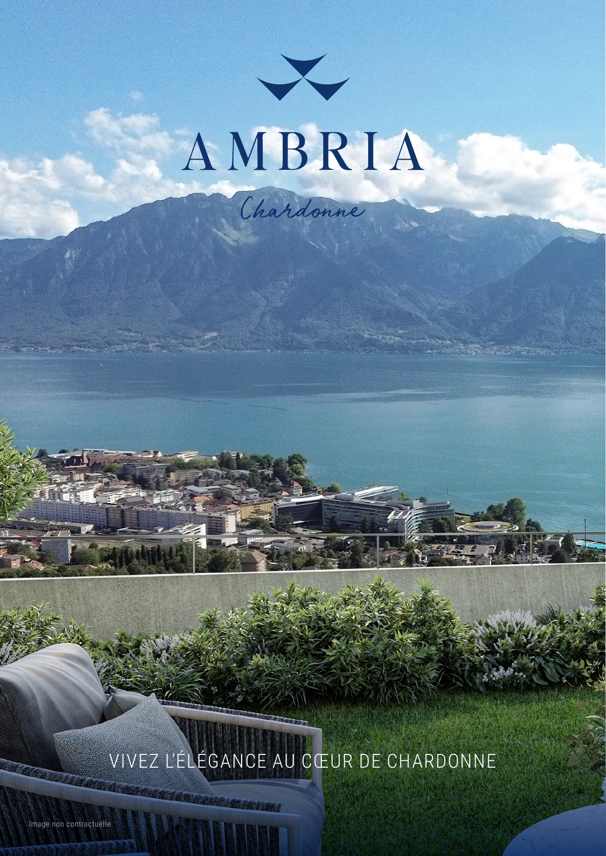
Eighteen apartments in Chardonne, on the vineyard terraces of Lavaux, a UNESCO World Heritage site facing Lake Geneva and the Alps. Three small buildings of six apartments each, from 2.5 to 4.5 rooms, sold off-plan by OMNIA Immobilier. The brand had to exist before the first stone: a symbol, a voice, and everything a buyer would see — posters, brochure, website, launch and open days.
Problem
Every promotion on this hillside shows the same lake, the same vines, the same sunset. AMBRIA had to feel as calm and rare as the place without sliding into the generic “view for sale” look, and hold together from an A0 poster in the agency window down to a phone screen.
Solution
The name comes from amber, the warm light that falls on the vines at sunset, a stone long tied to calm and protection. After four rounds of symbols, and a second name on the table, the mark draws from Chardonne itself: the goldfinch of the village's coat of arms, the three buildings and the glint of amber, folded into one sign.
A deep lake navy and a warm sand carry the system, set in Editor's Note with a handwritten Run Wild for the place name, and a pattern cut from the symbol closes every page. The same grammar runs through the posters, the 28-page brochure, the website and the launch campaign.
Léman Navy
#11326C
Amber Sand
#E6D6C4
Lavaux Sky
#4986BF
White
#FFFFFF